DOCKSIDE
Seattle, Washington
-
Architect: Graham Baba Architects
Photography: Andrew Pogue -
2019 VMSD Retail Renovation Award - Conversion
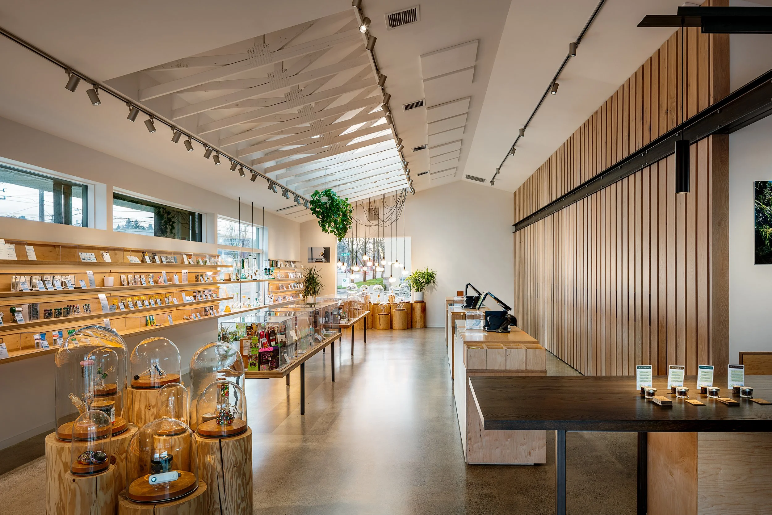
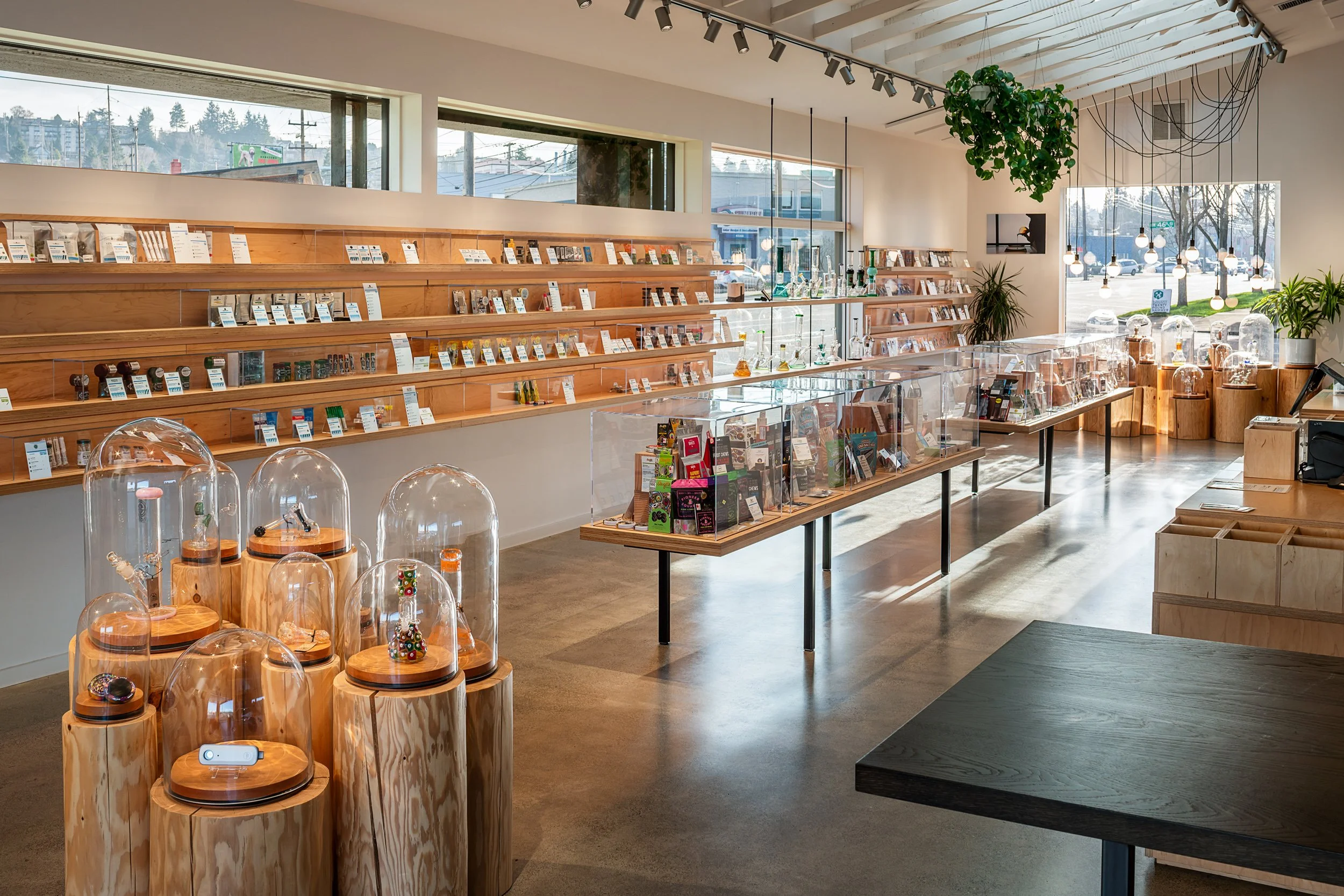
Designed to encourage exploration and conversation, this cannabis shop replaces the traditional counter-driven model with an open, light-filled retail experience.
When Dockside, a Seattle-based chain of recreational cannabis shops, sought to expand into a rapidly changing neighborhood, the challenge was how to define the brand experience within a growing and shifting cannabis marketplace. The solution was to redefine the typical shopping experience through the creation of a sophisticated and inviting environment—a venue that offers a unique visual identity paired with an educationally focused customer experience.
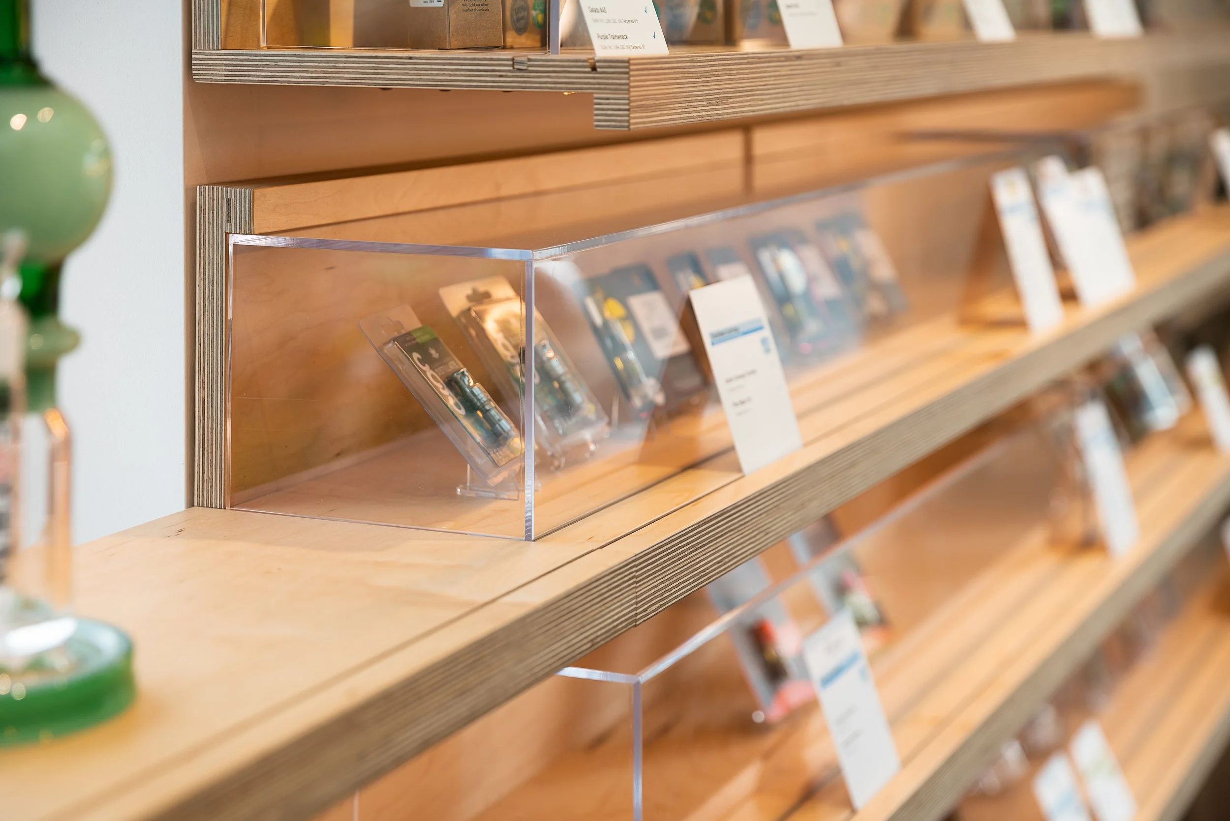
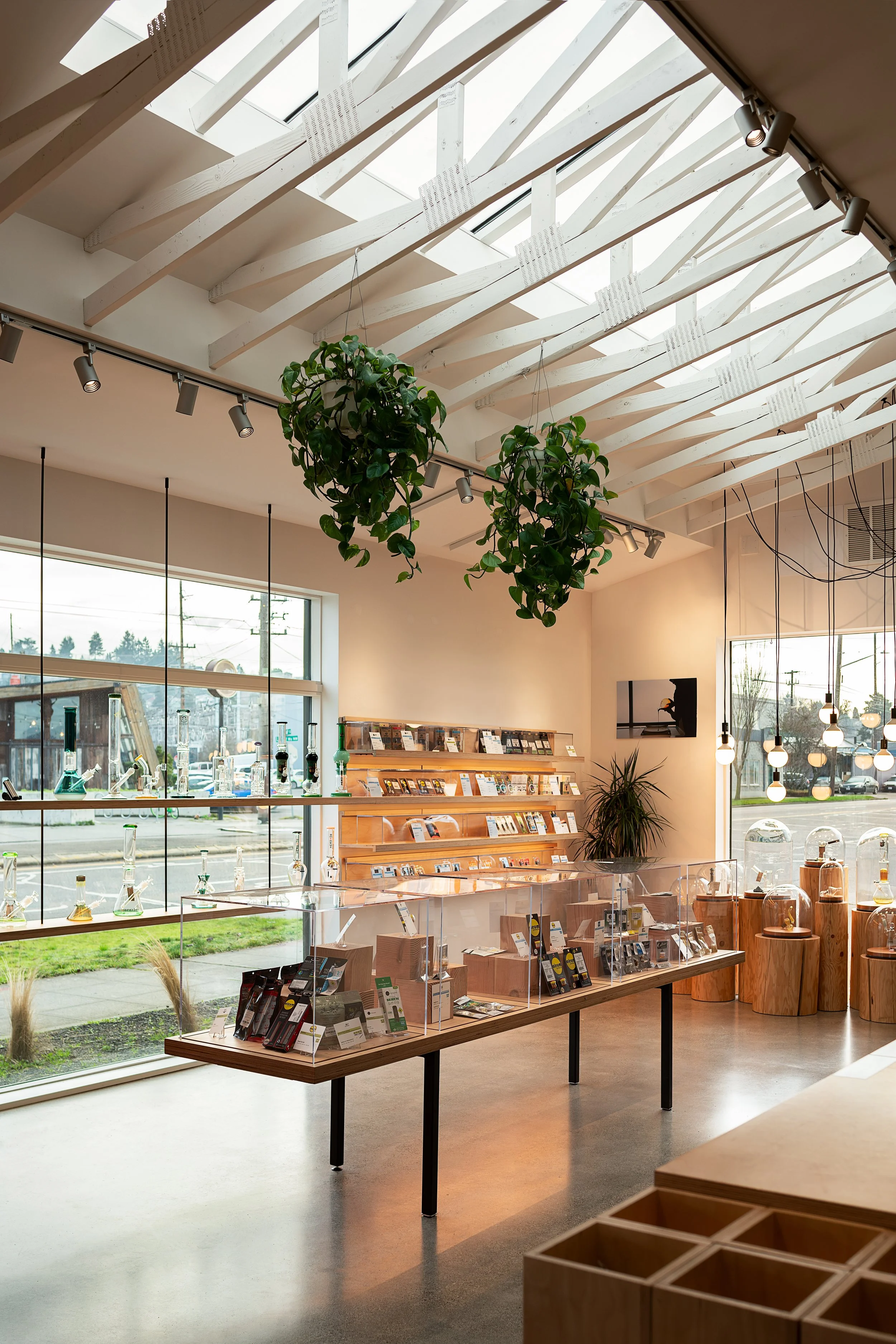
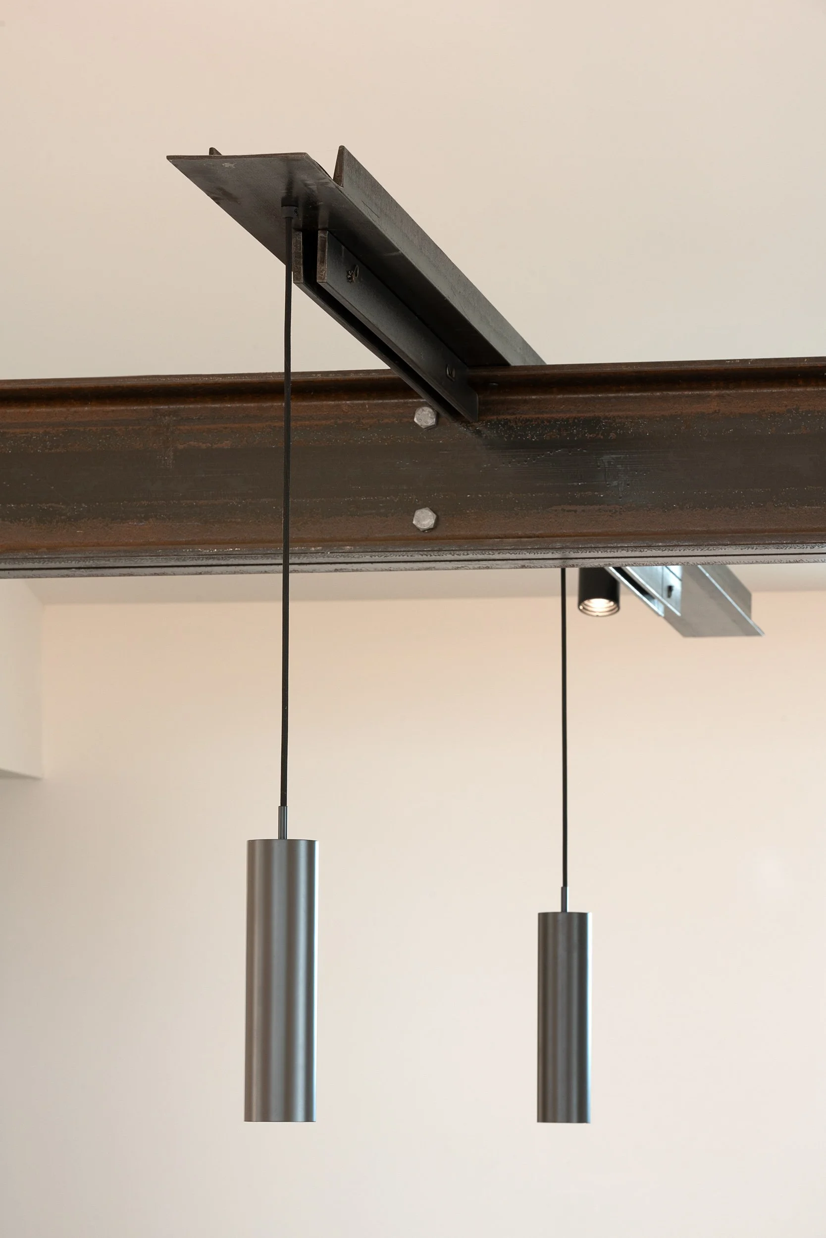
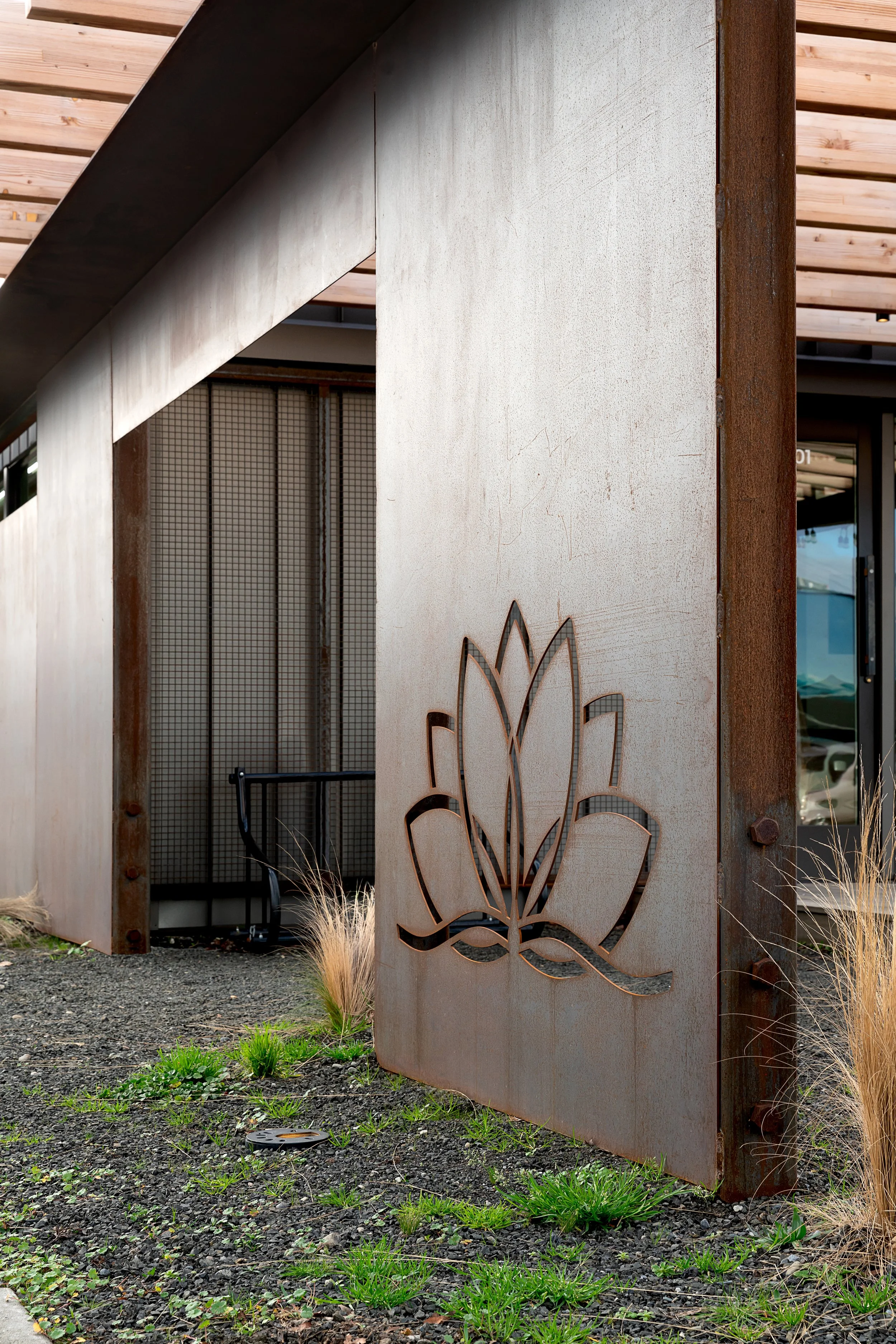
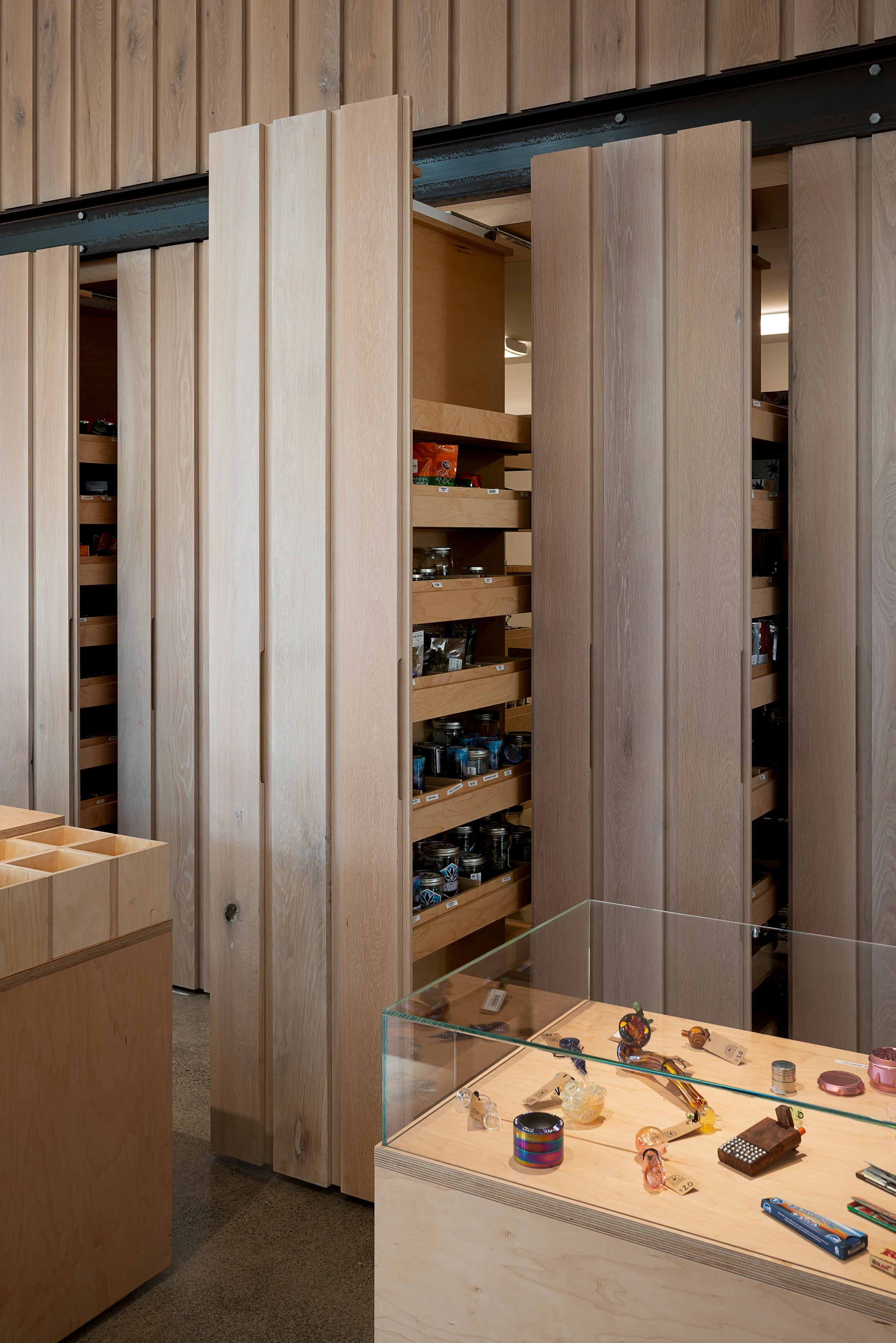
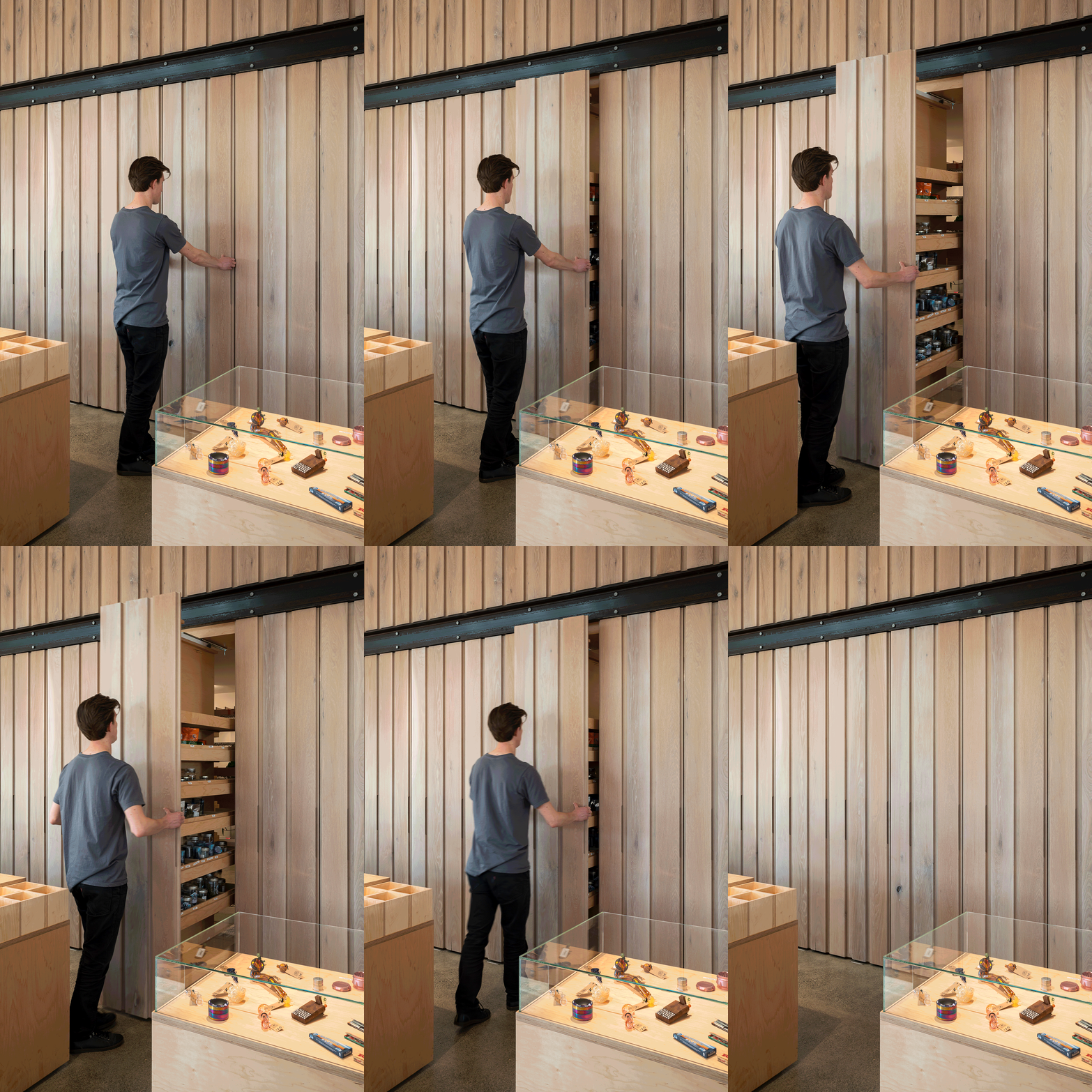
The project transforms an existing, nondescript one-story building into a 1,930-square-foot shop that retains the footprint and height of the original structure to preserve the neighborhood scale. A new wood trellis and deck define the entry and provide a venue for outdoor gatherings and events. The exterior—composed of dark metal siding and roofing with corten metal accents—creates a visually quiet presence on a busy thoroughfare. Ample glazing at the entry and street façade produces an inviting level of transparency, reinforcing the image of cannabis as a mainstream product. Inside, the space is bright and airy, courtesy of light-stained maple and white oak, plywood cabinetry and display cases, and a skylight inserted into the existing roof. Daylight filters through exposed scissor trusses overhead while polished concrete floors provide a clean, no-fuss surface below. Wood shelving and tables feature steel accents and provide a minimalist contemporary aesthetic for products housed under glass cloches and in vitrines, a display method that enables customers to peruse the merchandise while still complying with strict, no-touch city regulations. Products are stored in efficient pull-out cabinets that can be stocked directly from the back room. When fully closed, these tall, vertical cabinets resemble a wood-paneled wall and serve as a simple backdrop for the sales counter. Sales staff assist customers on the sales floor as they browse the products rather than from behind the counter, which is only used for the final transaction. This approach fosters a comfortable and informative conversation with staff by removing the pressure to quickly decide and make a purchase while other customers are waiting in line. Express purchases, ordered online in advance, can be quickly picked up at a table located just inside the entry. Medical consultations take place at a small desk tucked into a private corner removed from the main sales space.
By eliminating the clutter and the bottleneck of a traditional cannabis shop sales counter, customers can enjoy a personalized, leisurely browsing experience in a tranquil, visually calming environment. The fresh, natural material palette and bright, transparent space provide just the right positive image to this newly-legal sector of products.


